The MCU is filled with so many character designs for its heroes that some were bound to fall flat. Of those that did, these are the worst.

Despite hitting the mark most of the time, the MCU is not impervious to underwhelming hero designs. Some of the best costumes in superhero movies have emerged from the MCU, not least among them being Iron Man’s Mark III armor, which helped to launch the franchise into being the cinematic powerhouse it is today. Yet, as would later be revealed, not even Tony Stark’s penchant for flair can preclude him from developing some significant eyesores.
Marvel does tread a fine line when it comes to adapting some of the more garish outfits from the comics. Sometimes, the creative liberties that the MCU takes when adapting a brightly colored superhero costume for the big screen help the audience take the wearer more seriously. In other instances, it can change the Marvel hero’s appearance beyond recognition in a less favorable way, making them far more bland than their skill set would otherwise suggest.
10. Sam Wilson’s Half-Helmet Is Hard To Take Seriously
Appeared In The Falcon And The Winter Soldier (2021)
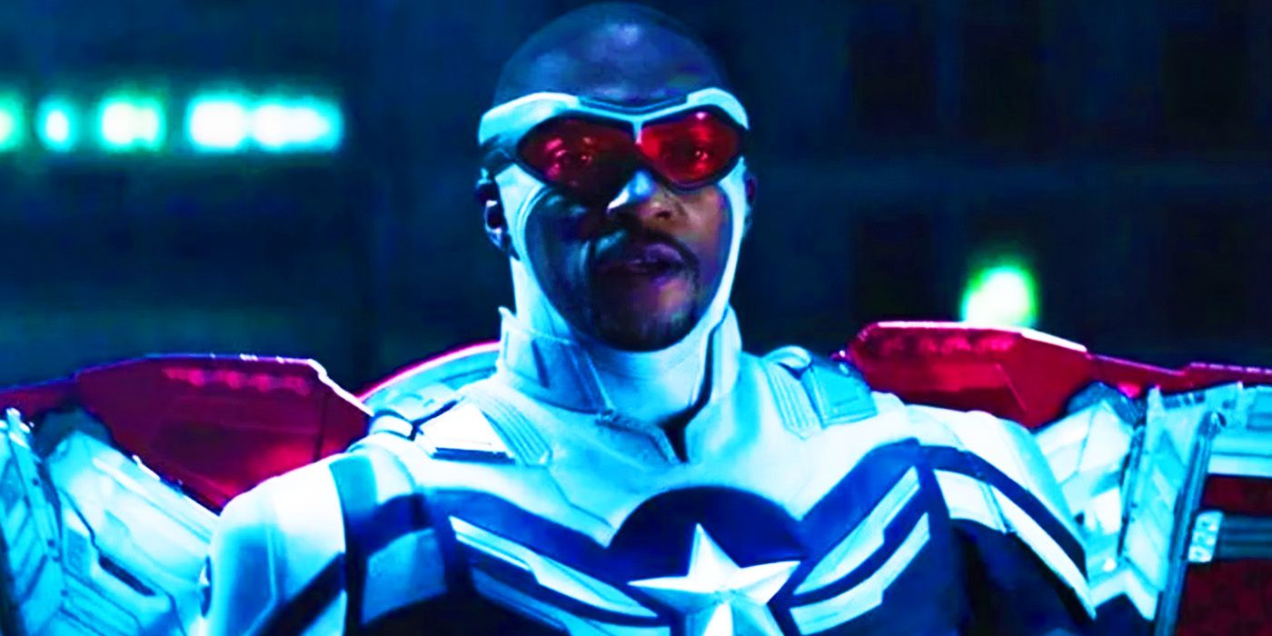
Sam Wilson’s debut as Captain America occurred in The Falcon and the Winter Soldier and entailed the big reveal of his new star-spangled suit. To the MCU’s credit, this was an accurate rendition of Sam Wilson’s Captain America in Marvel Comics, though the excessive use of white is arguably quite garish. What is harder to overlook, though, is Sam’s distracting semi-cowl that covers just the lower half of his head. The result is a good argument for why Marvel tends to tone down the source material in other properties.
This will likely be the only time that Sam’s comic-accurate Captain America suit will be depicted on-screen, making its fleeting appearance in the final episode of The Falcon and the Winter Soldier easier to stomach. His new suit will debut in Captain America: Brave New World, which will likely opt for a more toned-down color scheme and forego the distracting headwear for a simpler set of goggles. While it is far from the worst costume in the MCU, Marvel can at least claim that it has ticked that comic-accurate box with this design and move on.
9. Druig’s Outfit Is The Blandest Of A Bland Lineup
Appeared In Eternals (2021)
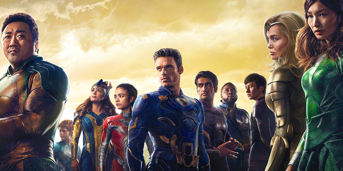
The titular team of Eternals had contentious character designs, with some applauding the celestial and otherworldly veneer of their collective outfits, while others suggested that they didn’t go far enough. It is hard to deny that their “uniform” appearance is just that, with variations between characters limited to color schemes. Druig, unfortunately, is the least inspiring of these, with a black-and-red outfit that significantly contrasts his green-and-purple robes from the comics. While it could be argued that his comic book style looks too similar to Kang the Conqueror, the decidedly more muted getup seems like a drastic alternative.
Eternals was a controversial movie as it dared to push the boundaries of the MCU in a post-Infinity Saga landscape. Recent years have arguably seen sentiments toward the Celestial-indentured demigods improve in hindsight, potentially improving the chances for a sequel to pay off the Eternals’ cliffhanger ending. Should that happen, a switch-up of the outfits to more closely resemble the unique array of designs of the comics would go a long way to making Druig stand out.
8. Hope Van Dyne Lacked Her Classic Color Scheme
Appeared In Ant-Man And The Wasp (2018)
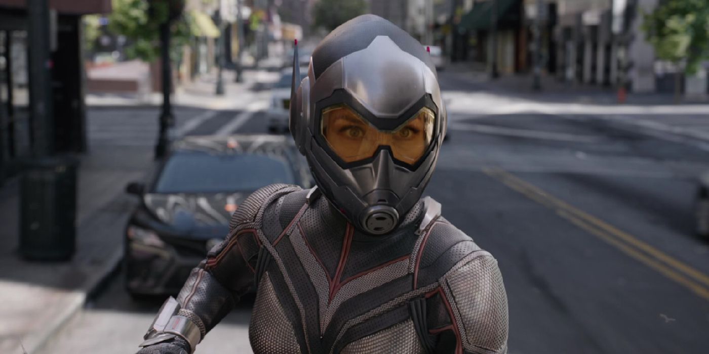
It can be easy to swing too far in the other direction when Marvel decides to depict a more grounded rendition of a super-suit, which is exactly what happened with Hope Van Dyne’s boring design in the majority of Ant-Man and the Wasp. The decision to switch out yellow for gold that borders on beige is all the more baffling when considering the reveal of Hope’s costume-to-be in 2015’s Ant-Man looked even slightly more vibrant. Instead, her debut as a main character made her chosen mantle difficult to visually justify beyond the set of wings.
A possible reason for Hope’s golden color scheme is that it helped distance her super-suit from that of Darren Cross’ similarly styled Yellowjacket suit in Ant-Man.
The Wasp’s muted design would later be rectified as Ant-Man and the Wasp: Quantumania fully leaned into the more vibrant yellow palette of her namesake. While this would, unfortunately, debut in the MCU’s worst-rated movie, hope remains that Hope will keep the bright yellow palette going in future appearances. As it currently stands, this is most likely to occur in one of MCU Phase 6’s Avengers movies.
7. Hawkeye’s Lack Of Flair Is An Insult To His Origins
Appeared In Avengers (2012)
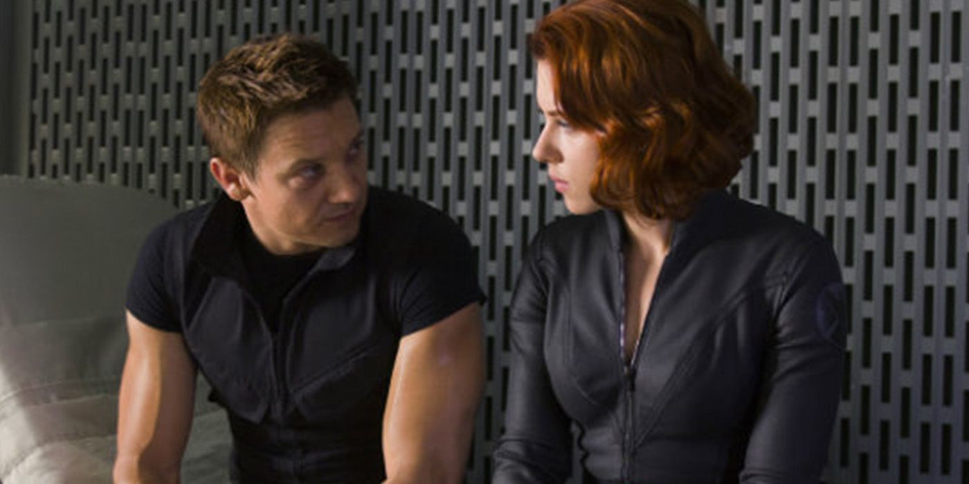
Hawkeye is arguably one of those Marvel characters whose comic book outfit is so cartoonish that it required significant revisions for the big screen. Yet the slightest hint of maroon on an otherwise all-black outfit was extremely unhelpful in making Hawkeye stand out from his super-powered peers in their iconic lineup, which only helped to widen the conspicuous gulf between their abilities. Future appearances would only compound this rather than afford Hawkeye a distinct wardrobe with each outing like his more outlandish peers.
The possible thought process behind Hawkeye’s understated design is reasonable, given that he represents the most grounded aspects of the Avengers. Yet the MCU couldn’t resist indulging in its own “yellow spandex” moment when Kate Bishop drafted a mock-up of a more dynamic suit for Hawkeye in his self-titled series – a comic-accurate depiction that Clint Barton balked at. Hawkeye’s MCU-spanning wardrobe has remained uninspiring, and with him in retirement once more, time is running out for at least a fleeting appearance of his purple-pointed mask as a proper nod to fans before Renner’s Barton is gone for good.
6. Iron Man’s Mk XLVII Armor Looks Unfinished
Appeared In Spider-Man: Homecoming (2017)
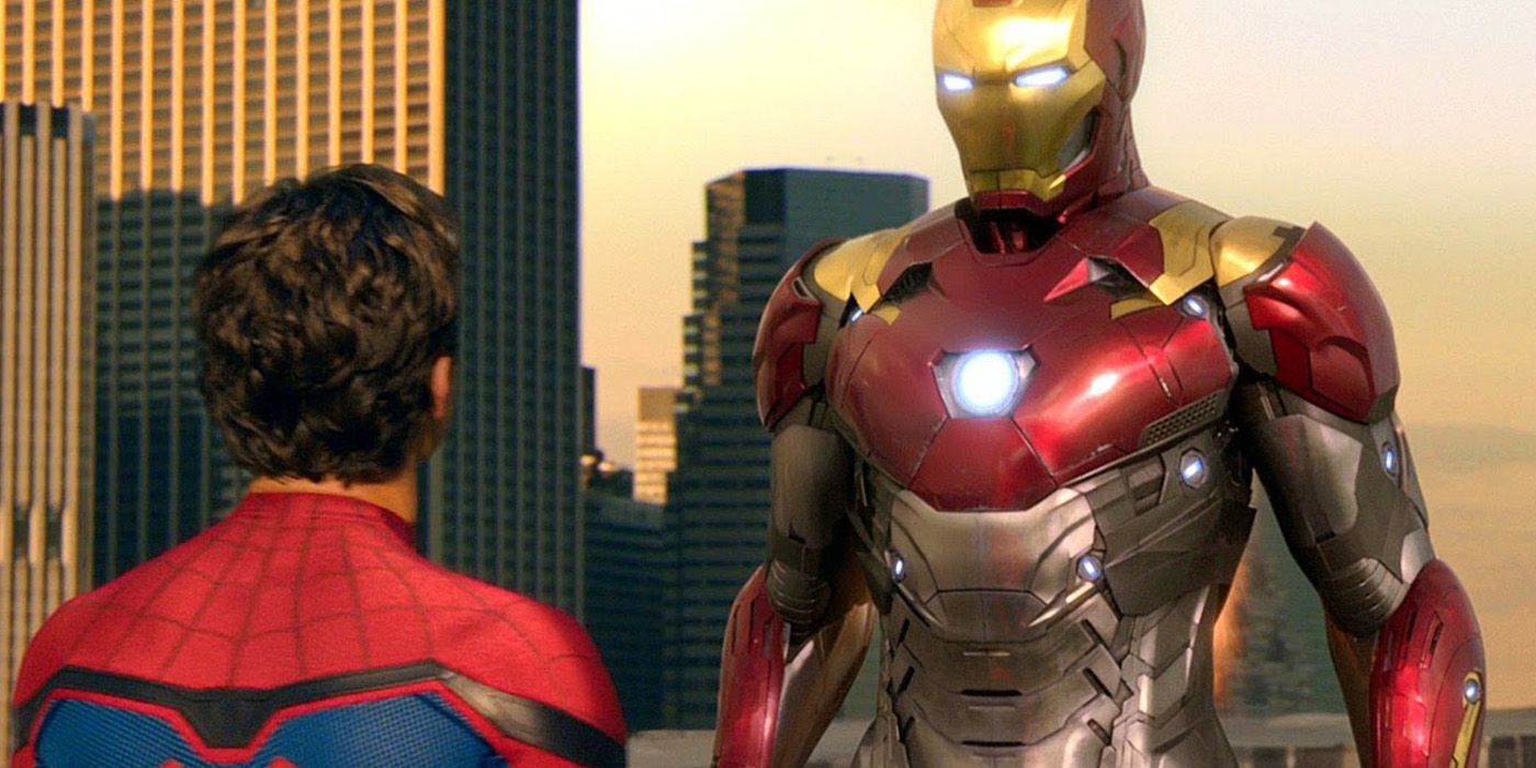
Iron Man’s MCU journey saw him create a grand total of 85 suits of armor. With so much room for error, there was bound to be at least a handful of less aesthetically pleasing designs. Of the ones Tony Stark wore in earnest, the Mk XLVII armor that features in Spider-Man: Homecoming fits that description. In a bid to differentiate it from preceding designs while keeping his classic red-and-gold scheme alive, the Mk XLVII opted to incorporate a stainless steel midriff that not only clashes with the traditional palette but only works to make Iron Man’s armor look incomplete.
There have been worse suits shown in Iron Man’s armory, but it’s hard to reconcile Tony’s penchant for flair with his decision to go out superhero-ing with this particular suit. Thankfully, Iron Man’s litany of iconic MCU suits are more than enough to overlook this misstep, helping to keep Tony’s legacy intact. In fact, his next big screen appearance in Avengers: Infinity War would debut one of his best, though unconvincing CGI arguably hampered it.
5. Quicksilver’s Running Gear Is Pedestrian
Appeared In Avengers: Age Of Ultron (2015)
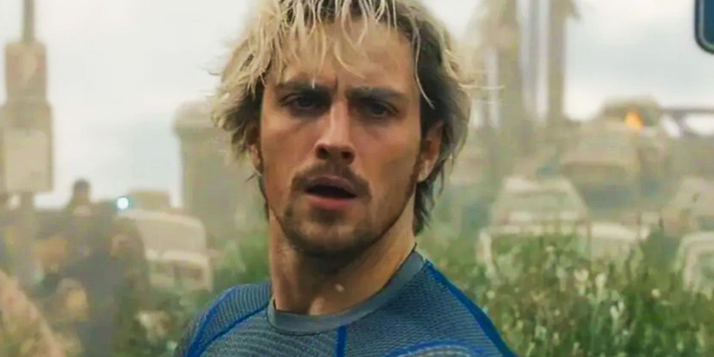
Quicksilver’s MCU debut was disappointing for several reasons. The fact that bullets cut the speedster’s MCU career short is one large bone of contention, but his forgettable design did not help matters. His skintight blue shirt is indistinguishable from a sports tee that can be purchased by anyone. Quicksilver’s appearance in Avengers: Age of Ultron is arguably pretty close to his comic book design, but the fact that a simple thunderbolt splashed across his torso was all he needed to clear the gap makes it harder to stomach.
One thing in the MCU’s favor is that Pietro’s outfit is at least better than the one used in Fox’s X-Men franchise. The titular team’s famously too-muted designs have long been a cause of ire from comic book fans, and Marvel at least got close to emulating Quicksilver’s blue-and-silver design. Unfortunately, like Quicksilver’s ill-fated plan to stop bullets from hitting innocents, it didn’t go far enough.
4. Daredevil’s Yellow Mask Is Garish
Appeared In She-Hulk: Attorney At Law (2022)
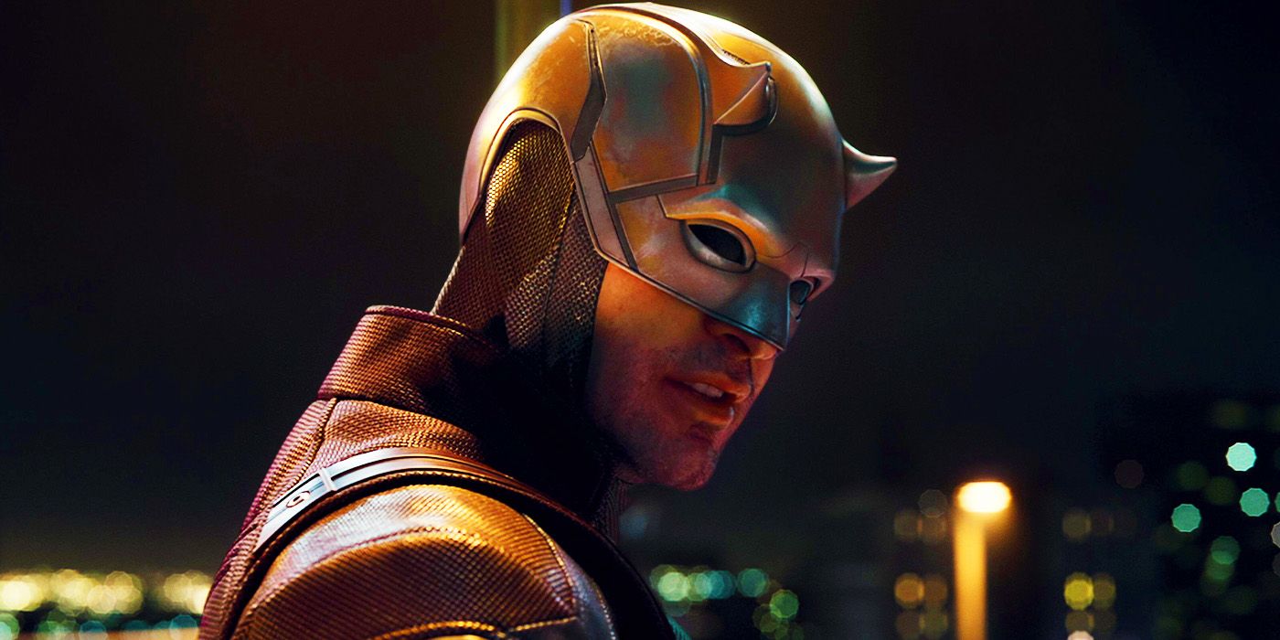
Matt Murdock’s jaunt across various MCU productions recently saw him co-star in She-Hulk: Attorney At Law. Unfortunately, he did so sporting an inexplicable yellow-and-red outfit, the creation of which was courtesy of his client, Luke Jacobson. The look was at least consistent with the lighthearted tone of the series – and in stark contrast to the grittier tone of his own. With that in mind, having Murdock sport this particular crime against fashion in a fleeting appearance is more excusable.
In Marvel’s defense, the comic book suit on which it is modeled is widely lambasted. The clashing colors don’t do much for Daredevil’s ability to inspire fear. Thankfully, set photos that show Charlie Cox’s Daredevil in his upcoming series, Daredevil: Born Again, seem to reveal that he has returned to his blood-red roots, consigning this ill-advised break from the norm to the more vibrant color schemes of She-Hulk for good.
3. Third-Eye Strange Was Difficult To Look At
Appeared In Doctor Strange In The Multiverse Of Madness (2022)
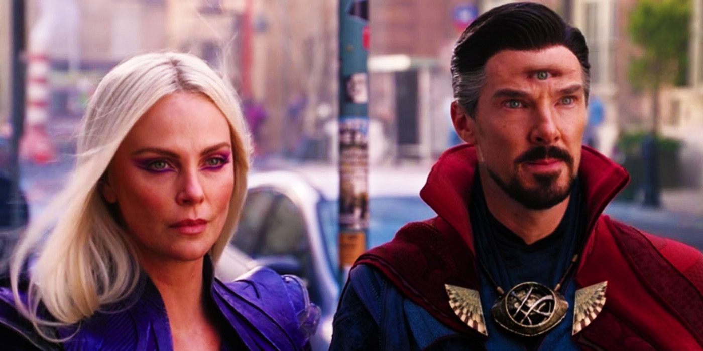
Given the inherently uncanny nature of a third eye, Marvel should be afforded a little leeway in its depiction in Doctor Strange in the Multiverse of Madness. While most of the criticisms leveled against Doctor Strange’s latest acquisition concern poorly rendered CGI, it is difficult to see how even a perfectly rendered third eye would not have been just as distracting. Unfortunately, the apparently necessary development looks to be set to feature heavily in his upcoming sequel, as it emerged in a post-credits setup scene.
One way in which Marvel could possibly circumvent the unsettling presence of a third eye is to make it look less human in Doctor Strange 3. In the comics, Doctor Strange’s third eye does not always closely resemble his original two, making it appear instead as a golden orb or like something that more closely resembles the Eye of Sauron in The Lord of the Rings. Whatever happens, Marvel should prioritize a solution that will prevent Doctor Strange 3 from being an extended excursion into the uncanny valley, lest it obstruct the wider narrative.
2. Hulkbuster Banner Added Insult To Injury
Appeared In Avengers: Infinity War (2018)
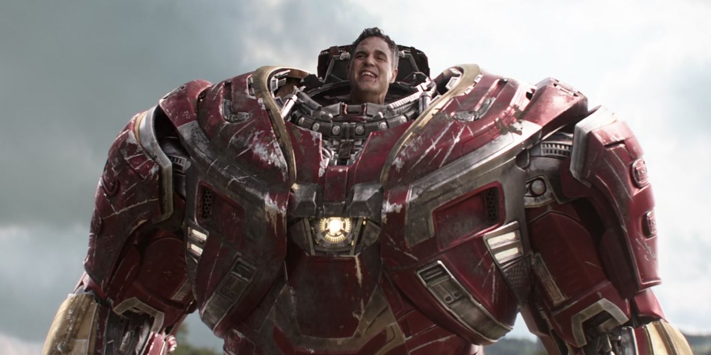
Bruce Banner’s involvement in the Battle of Wakanda saw him add to the handful of examples of bad CGI in the MCU. Yet this wasn’t the only reason that Bruce Banner’s character design in the climax of the Infinity Saga was disappointing. Even worse was the dismal circumstances it represented and the fact that audiences would no longer see Hulk in all his rage-fueled glory. Instead of having Hulk make a significant dent in the forces attacking Wakanda, he was forced to rely on one of the tools that represented how much Hulk was nerfed throughout his MCU career.
Taken on its own, the Hulkbuster armor is one of the greatest designs in the MCU. But its time in the sun came as Tony Stark wielded it against an out-of-control Hulk who should have mopped the floor with just about everyone in Avengers: Age of Ultron – whereas Hulk arguably never got his own power-defining moment. The result of having Banner engage in one of the MCU’s most consequential battles with a weapon designed to defeat Hulk, instead of using Hulk, feels like the final insult to Hulk’s MCU legacy.
The arrival of Hulk’s son, Skaar, hints that Hulk’s return in a World War Hulk adaptation may be possible – though it is still a meager possibility in the Multiverse Saga.
1. Danny Rand Refused To Wear His Suit
Appeared In Iron Fist (2017)
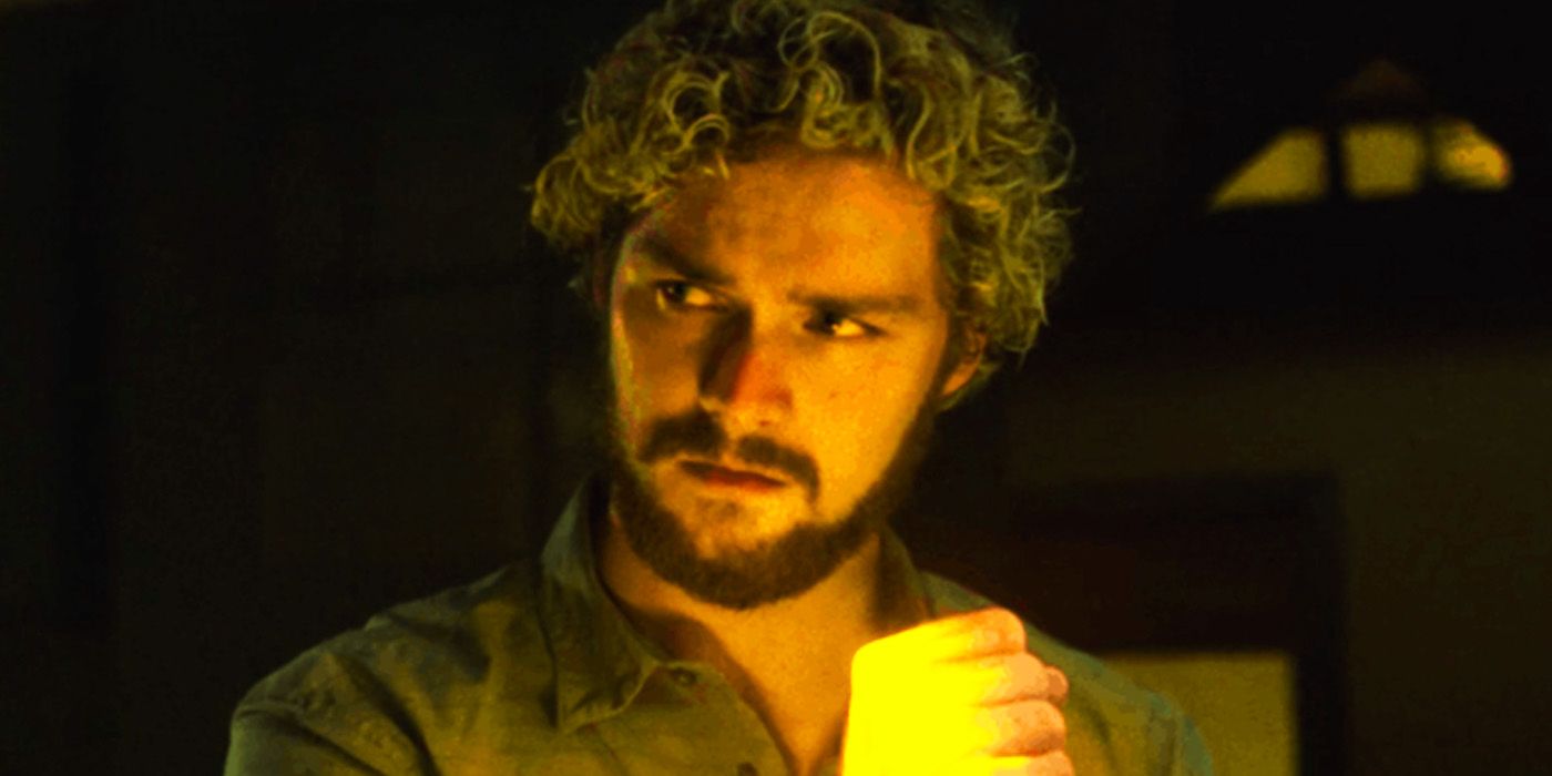
The Defenders are not the most ostentatious of Marvel’s superhero teams, but between Daredevil and Iron Fist, the outlandish superhero visage should be covered. That is, at least, if Danny Rand had decided to don his iconic outfit throughout his debut series. Instead, the ire that the series drew in part for Danny Rand’s distinctly unlikable persona was only compounded by his apparent refusal to adopt his instantly recognizable costume.
Iron Fist‘s showrunner, Scott Buck, defended the decision to omit Iron Fist’s classic look in his debut series in the run-up to its release, stating that there was no reason to include it as Danny Rand was still navigating his newfound identity. This is understandable, though in the end it probably didn’t help matters, as the show became one of the MCU‘s worst-rated. After all, Daredevil made sure to sport at least one iconic look during his debut, while Luke Cage featured at least a nod to his classic comic book appearance.
