From Bad to Worse: The 10 Least Impressive MCU Villain Designs
The MCU has featured many villains from Marvel Comics, but the franchise hasn’t always been great at their designs – with these being the worst.
When it comes to adapting villains in the MCU, some character designs are notably worse than others. With villains like Loki and Killmonger being standout examples, it is safe to say that antagonists can make or break an MCU movie. Meanwhile, villains like Thanos and Gorr the God Butcher help show that a good character design can make all the difference in that regard.
With that in mind, the MCU has a glowing record regarding its litany of powerful villains from Marvel Comics. There is a lot to be said for the sheer number of sympathetic MCU villains, including the Infinity Saga’s big bad himself, Thanos. This makes it a shame when a villain, no matter how compelling and iconic they may be, is hampered by a design that is either boring, badly rendered or too stark a departure from its intended design from the source material. With that in mind, these are the MCU’s worst-designed villains.
10. Dar-Benn’s Muted Design Did Not Inspire Much Fear
The Marvels (2023)
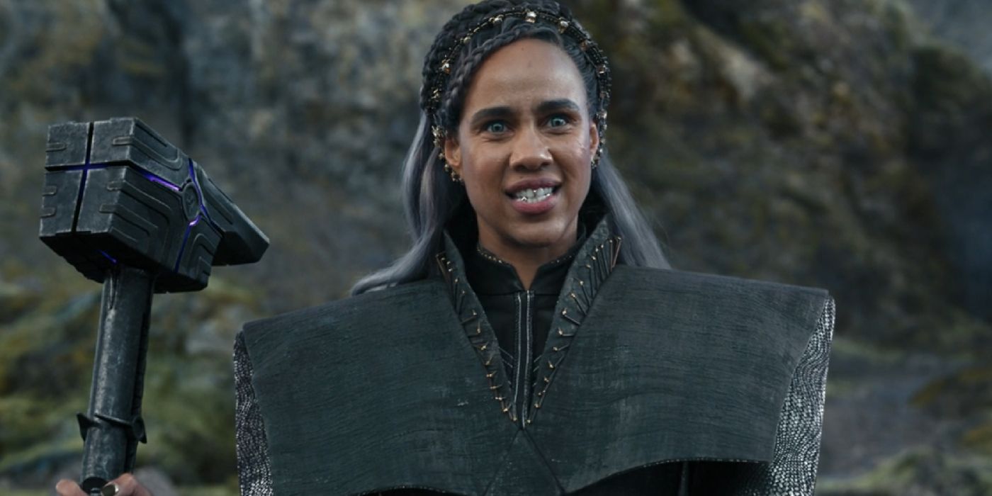
Dar-Benn is a Kree Supremor and revolutionary who quickly became one of the MCU’s aforementioned sympathetic villains. Despite her lofty status among her people, Dar-Benn sports a particularly muted wardrobe of mossy greens and grays, making her design slightly less memorable than her villainous predecessor, Yon-Rogg. Along with a weapon that was already seen in the clutches of Ronan the Accuser, Dar-Benn feels derivative on top of this, which is something that the purple-hued Quantum Band alone cannot redeem.
Zawe Ashton’s Dar-Benn had many redeeming qualities, but after Captain Marvel was well-established as one of the MCU’s most impossibly powerful heroes, she felt like a lackluster challenger. This was not helped by her character design, with even the Universal Weapon feeling like a knock-off Mjolnir. Her sinister line delivery and impressive ability to hold her own against Captain Marvel and her newfound cohort were spectacles in their own right, but weren’t helped by her drab wardrobe.
9. Ikaris’ Costume Didn’t Feel As Unique As It Should Have Been
Eternals (2021)
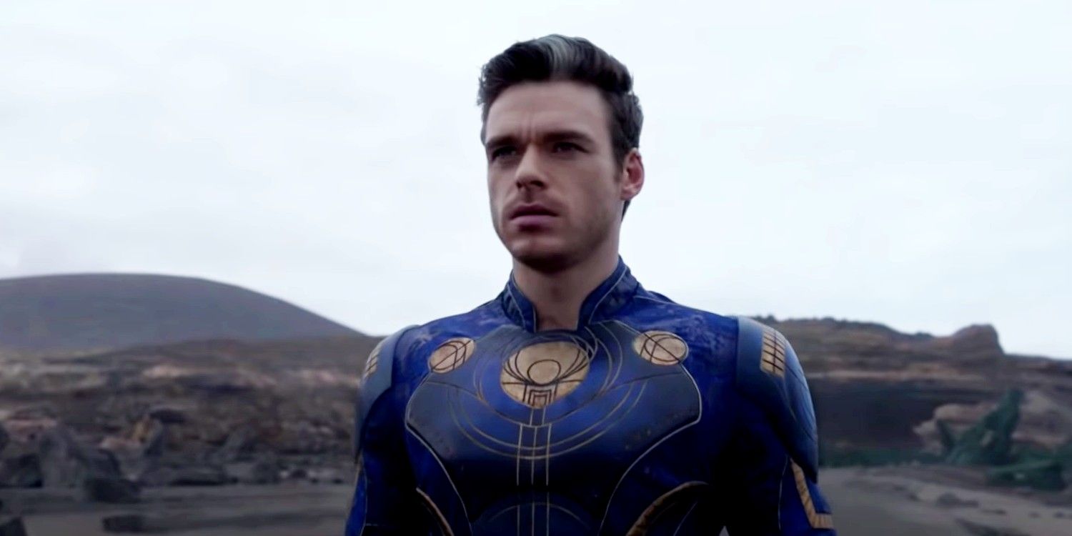
Eternals failed to inspire much enthusiasm among audiences, which was something compounded by their relatively uninspiring wardrobe. To Ikaris’ credit, his costume is one of the most comic-accurate of the team. Still, his all-blue suit with plastic shoulder pads and golden highlights isn’t particularly awe-inspiring. His outfit looks like something that could be found in a Kree’s wardrobe more than something conjured by a being that existed since the dawn of humanity.
Thor and Loki, by comparison, demonstrate what gods with a sense of flair can accomplish. In the difficult period of MCU Phase 4, the franchise needed its new roster of heroes to inspire as much impetus to visit theaters as Iron Man’s iconic red-and-gold armor and Thor’s regal cape-and-hammer. Instead, Ikaris’ modest ensemble was difficult to differentiate from his Eternal brethren-turned-nemeses, as well as the litany of other super-suits that made their cinematic debuts in the preceding decade.
8. Whiplash Was A Less Intimidating Iron Man Clone
Iron Man 2 (2010)
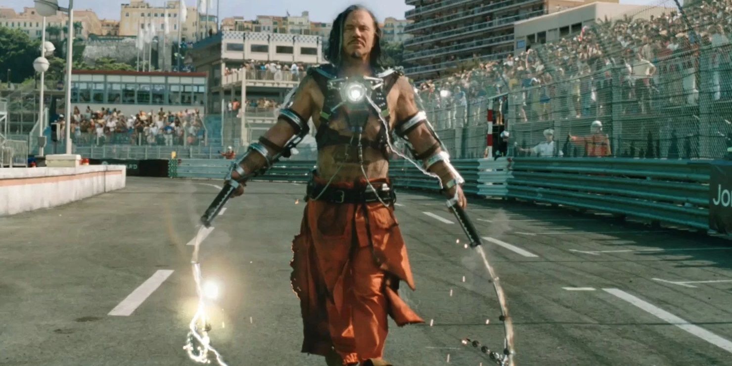
Whiplash sported two versions of his answer to Iron Man’s iconic suit in the span of Iron Man 2, but neither one was particularly intimidating in the face of Iron Man’s tech. The problem with Iron Man villains began with Ivan Vanko, whose villainous debut paled in comparison to other iconic MCU villains of the time like Red Skull. His cobbled-together exoskeleton in his first appearance helped to convey Vanko’s resourcefulness and inelegance, but did not carry the same impact as Red Skull’s terrifying face reveal.
It is also hard to overlook the impractical nature of his chosen weapon. Like a villain who brings a sword to a gun-fight, Whiplash’s whips aren’t the foil to Iron Man’s arsenal of lasers that Vanko was no doubt hoping they would be, relying instead on his self-destruct Hail Mary to imperil his adversary. This is compounded by the fact that Vanko’s appearance sidelined that of the far more iconic Iron Man villain, Crimson Dynamo, whose crimson suit would have been far more memorable.
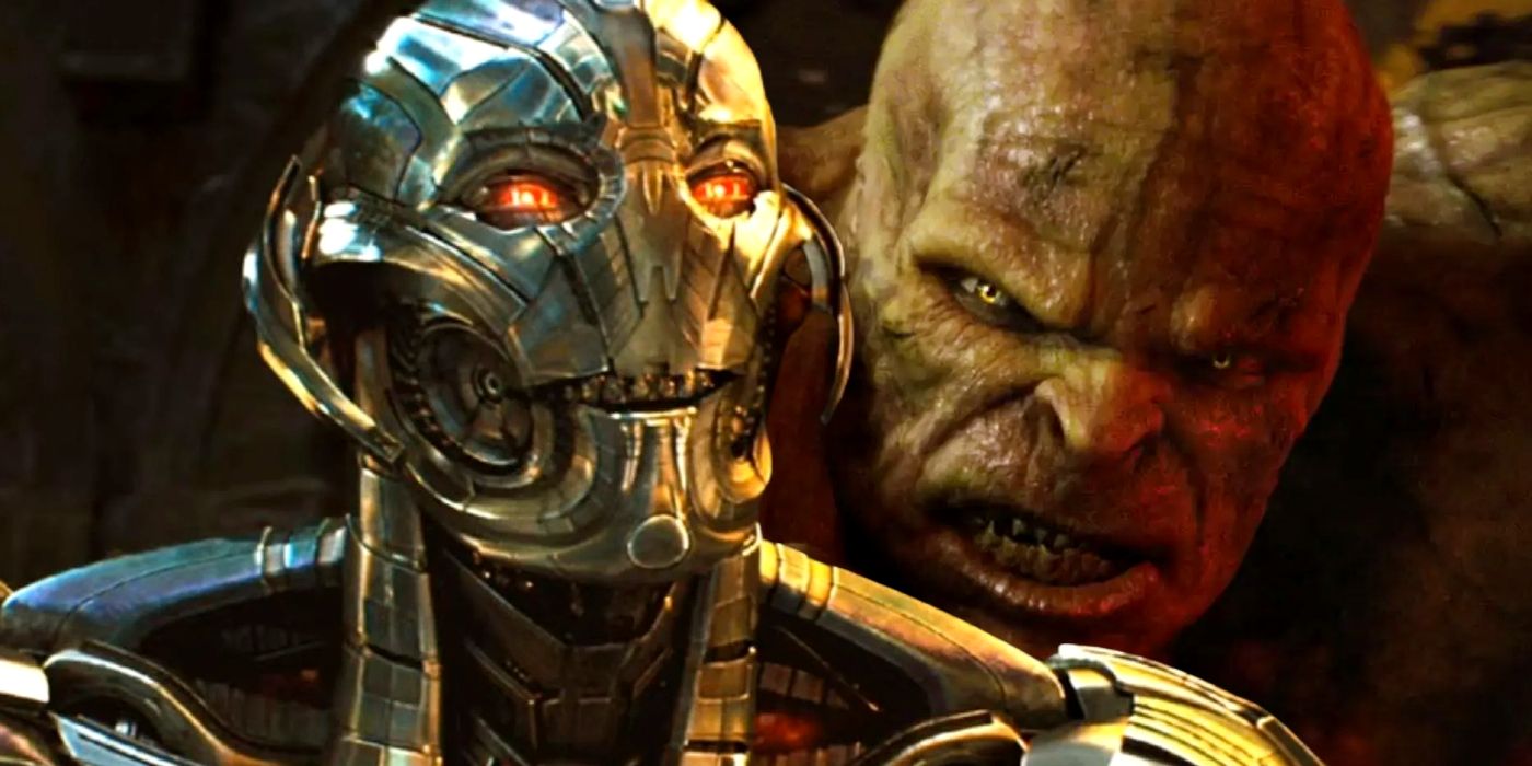
7. Ultron’s Design Diminished His Fear Factor
Avengers: Age of Ultron (2015)
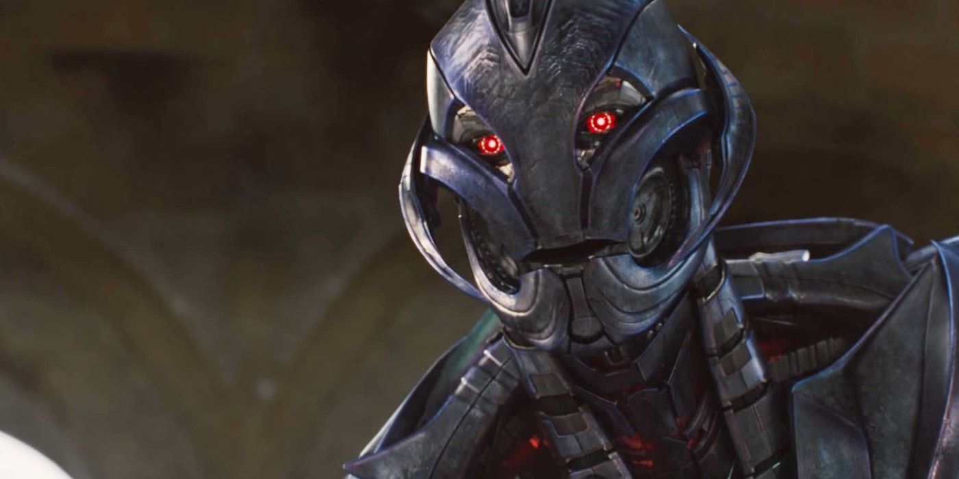
For an AI that was quick to eschew humans and their destructive nature, Ultron was seemingly quite fond of how they looked. Ultron was far from the worst example of CGI in the MCU, but the robotic mercilessness that was supposed to be central to his character was diminished by his expressive face. This helped to blunt his villainy in moments where Ultron’s glowing red eyes would convey a playful glee as he cracked yet another quip. Why he gave himself robot teeth in the process of creating his final form, meanwhile, is anyone’s guess.
One of the main criticisms leveled against Avengers: Age of Ultron was how its eponymous arch-villain was handled. The severity of James Spader’s arch-villain was counterbalanced by his capacity to crack one-liners during his quest to eradicate humanity. This, along with a design that looks particularly dumbed-down when compared to his comic book appearances, made Ultron’s MCU debut more disappointing than it should have been.
6. Spider-Man’s MCU Debut Ruined Shocker’s Memorable Design
Spider-Man: Homecoming (2017)
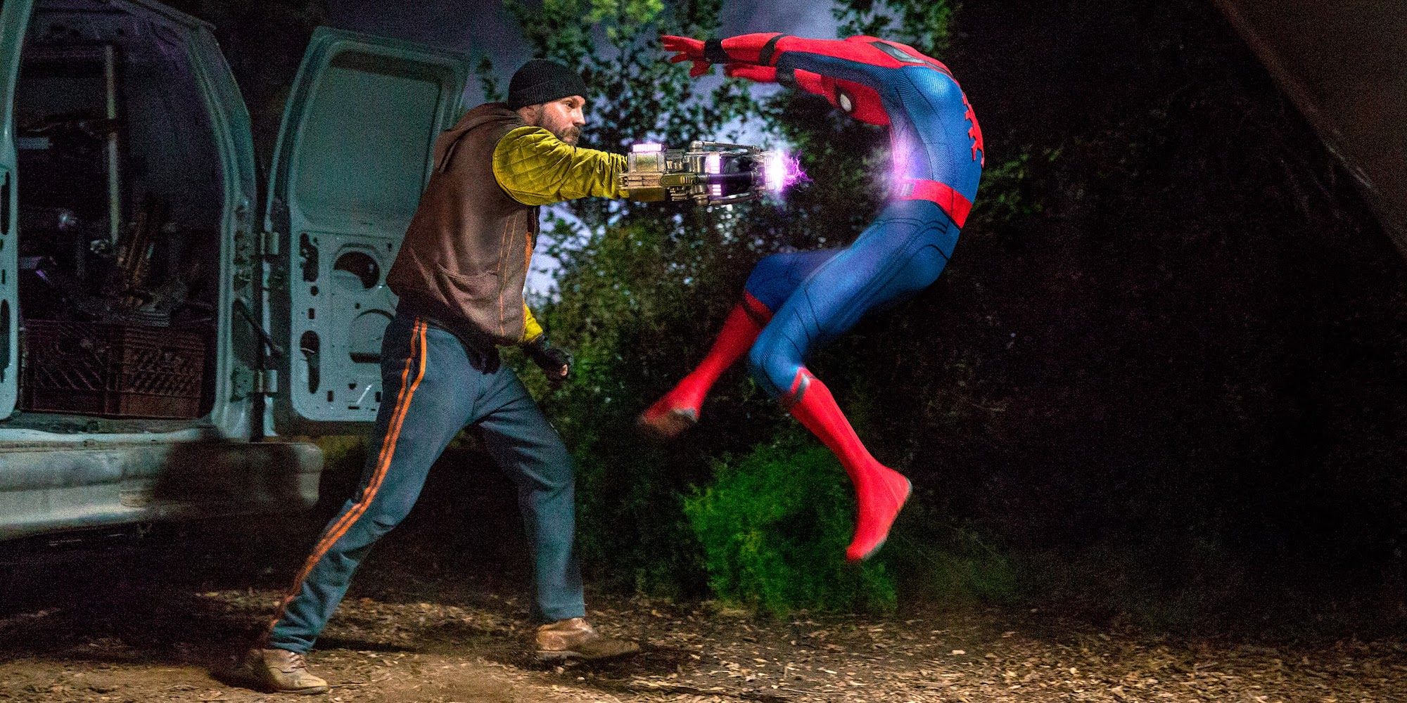
Shocker is a mantle held by two characters in the space of one movie, and neither one inspired much excitement. Both iterations, held by the characters Jackson Brice and Herman Schultz, merely hinted at the bright-yellow quilted design of Shocker’s full-body costume by restricting it to the arms. The rest of his outfit comprised plain-looking civilian clothes and a distinct lack of a mask.
This flies in the face of Shocker’s comic book reputation as one of Spider-Man’s most recognizable recurring villains. Part of what makes his rogues’ gallery so iconic is their vibrant character designs, with Goblin, Kraven the Hunter, and Mysterio being just a few standout examples. Shocker’s outfit exemplifies the cobbled-together nature of Adrian Toomes’ Chitauri tech-empowered crew, but Vulture’s suit being so terrifyingly striking makes Shocker’s toned-down design difficult to reconcile with.
5. Killian Was Painfully Boring
Iron Man 3 (2013)
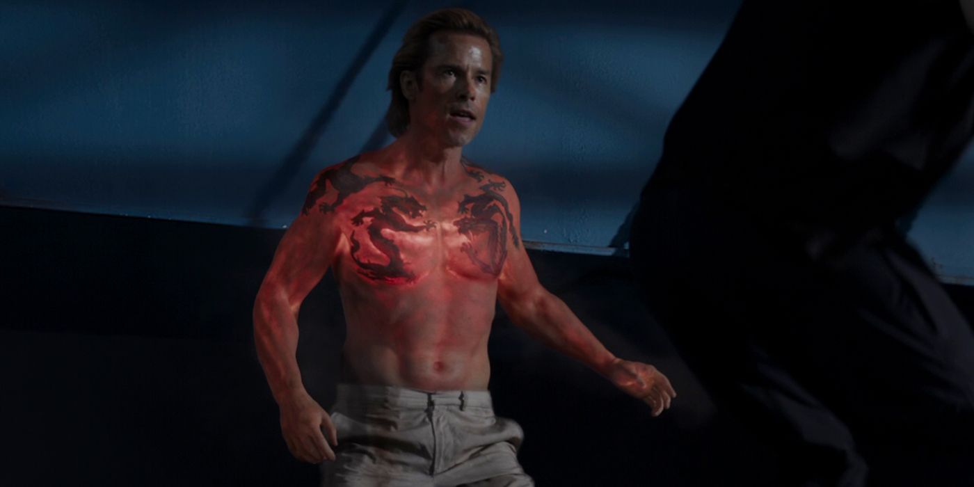
Aldrich Killian is another of the Iron Man trilogy’s missteps, turning an unremarkable side character from the comics into the main antagonist of Tony Stark’s finale. Killian’s design comprises a suit and sleazy persona, with some tacky tattoos that complete the ensemble when he sheds the suit in the movie’s final act. His use of Extremis as a heat-based weapon is not enough to redeem Killian’s disappointing reveal as the real brains behind the “Mandarin’s” operations. To top it off, his fire breathing is difficult to take seriously.
There is little about Killian’s sleazy CEO of AIM that sticks out beyond his Extremis powers. Even his overly-dorky younger self felt hammy, making his metamorphosis into the supposedly suave and sophisticated arch-villain of Iron Man 3 feel contrived. As Iron Man’s final villain in a solo movie, Killian felt lackluster – a sentiment that was worsened by the fact that Ben Kingsley’s outstanding portrayal of the movie’s supposed arch-villain was rug-pulled by the end.
Note: In the comics, AIM was eventually headed up by George Tarleton, AKA MODOK, which would have been a far more memorable villain than Killian and precluded Ant-Man and the Wasp: Quantumania from its maligned attempt at the character.
4. Abomination Lived Up To His Name
The Incredible Hulk (2008)
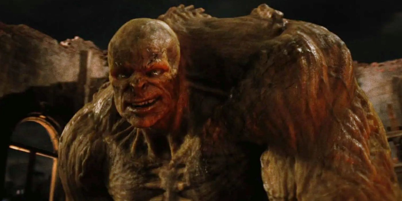
In his debut appearance in The Incredible Hulk, Abomination was difficult to look at – which is at least what the design was going for. His protruding skeleton, yellowish skin, and all-around ugly appearance certainly made him an unpleasant sight to behold, but it is difficult to overlook how much his initial appearance detracted from his classic design in the comics. Unfortunately, the CGI of 2008 also made certain shots featuring Abomination look particularly hard to believe. Ultimately, Abomination looked too similar to Hulk to be as interesting as he could have been.
The creative license used to distance Abomination from his comic book design was later rectified by the MCU in his appearances in Shang-Chi and the Legend of the Ten Rings and She-Hulk: Attorney at Law. In these appearances, Abomination has a far more unique appearance than his smaller green counterpart, even if he does sport the same skin color. Unfortunately, seeing this version of Abomination engaging in a rematch with Hulk is extremely unlikely, leaving their big fight at the mercy of this particularly unpleasant depiction.
3. Kro Was Confusing To Look At
Eternals (2021)
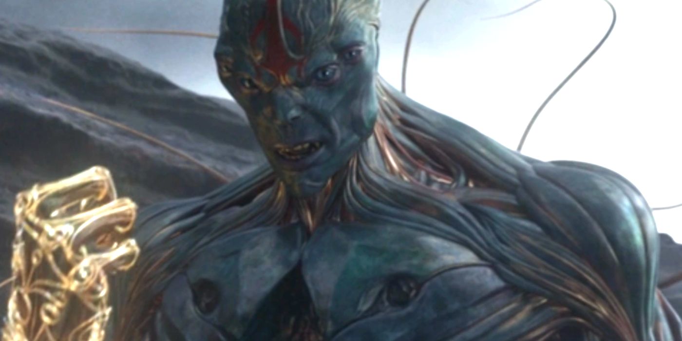
What the Eternals lacked in otherworldly identifiers, Kro and his team of Deviants made up for in spades, although they arguably fell too far in the opposite direction. Kro and the other Deviants are seemingly composed of tendrils aplenty in a confusing composition compounded by his two sets of eyes. Along with some questionable CGI, Kro looked too weird to be believable before his MCU tenure came to an unceremonious end at the hands of Thena.
Kro’s swift evolution from a bestial to a humanoid form was part of a narrative that made him a sympathetic adversary to the Eternals. They found common ground as the reluctant pawns of the Celestials, who emerged as the true villains of the movie after Kro’s initial antagonism. This made Kro – and Bill Skarsgard’s MCU debut – woefully underutilized, becoming all the more forgettable for his nigh-unintelligible character design.
2. Diamondback’s Villain Suit Was Laughable
Luke Cage (2016)
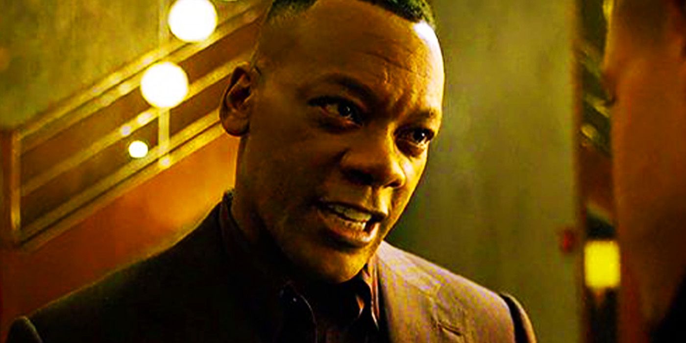
The ridiculousness of Diamondback’s getup in Luke Cage was immediately pointed out as he was poised to take on the titular hero in the Season 1 finale, as Bobby Fish exclaims, “What are you, some kind of pimp Stormtrooper?” Diamondback’s showdown with Cage required that he suit up in a costume that is at least somewhat faithful to the comics but makes it hard to take the villain seriously. The padded jacket, yellow undershirt, and flat-topped helmet help to make Diamondback one of the MCU’s most forgettable villains.
Diamondback’s costume was created by Hammer Industries and was one of very few Hammer Industries creations that was fit for purpose as it withstood Cage’s super-powered blows. Evidently, it was built for practicality over style, however. Diamondback is often seen as one of Luke Cage‘s few low-points, and this suit certainly didn’t help matters.
1. MODOK Is Notoriously The Worst-Designed MCU Villain
Ant-Man And The Wasp: Quantumania
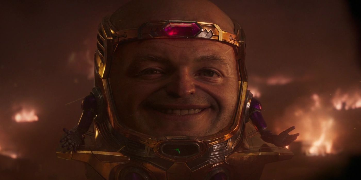
MODOK is an objectively outlandish villain from the offset, making his adaptation into live-action a dangerously difficult endeavor. Unfortunately, Ant-Man and the Wasp: Quantumania was unsuccessful in giving the iconic villain the debut he deserved, with laughable CGI and a questionable origin turning MODOK into a villain that sticks in the memory for all the wrong reasons. His ridiculous design is arguably what the movie leaned into by turning him into comic relief for the majority of his tenure, but that doesn’t preclude him from being the MCU’s worst-designed villain.
Ant-Man and the Wasp: Quantumania holds the unfortunate accolade of being the worst-rated MCU movie, and this isn’t helped by MODOK’s involvement. While MODOK’s Doomsday Chair is pretty faithful to its comic book origins, that is where the similarities end. Instead of a highly intelligent villain to be feared, MODOK was the brunt of the joke in a movie that disappointed many fans.
News

Pregnancy Twist in Sweet Magnolias Season 5? Heather Headley’s Latest Reveal Has Fans Talking
Season 4 of Sweet Magnolias ended on a sweet note. The new season, which premiered on Feb. 6, closed with Helen Decatur and Erik Whitley sharing the news of their engagement with…

Helen’s Pregnancy Shocker in Sweet Magnolias Season 5—And the Father’s Identity Will Leave You Speechless
Sweet Magnolias fans are wondering whether Helen’s wishes will finally come true and she’ll have a baby in the show. The romantic drama that is now making waves on Netflix…

Sweet Magnolias Season 5 Just Fixed Its Biggest Mistake – Watch the New Trailer & See the Changes Fans Have Been Waiting For!
The fourth season of Sweet Magnolias is here, and it was truly worth the wait. There are a lot of great storylines to come out of this season, which starts with a Halloween…

Jamie Lynn Spears’ Shocking Pregnancy Storyline in Sweet Magnolias Season 5—Why She Calls It ‘The Opposite of Fun’
Jamie Lynn Spears Opens Up About Teenage Pregnancy and How ‘Sweet Magnolias’ Helped Her Heal Jamie Lynn Spears has never shied away from the challenges she faced as a teenager…
Who’s in Love? Meet the Real-Life Lovers of XO, Kitty Season 3’s Cast – Some Will Shock You
Anna Cathcart’s Kitty Song-Covey and her high-school romantic entanglements in XO, Kitty have hooked fans. The Netflix show’s ensemble cast has impressively captured the varied stages of love and heartbreak, the bittersweet…
The Untold Story of the Only Sweet Magnolias Star Who Became a Teen Mom and Britney Spears’ Guardian for 11 Years
Sweet Magnolias star Jamie Lynn Spears is behind Noreen Fitzgibbons who initially had an affair with Maddie Townsend’s ex-husband. Sweet Magnolias’ Noreen Fitzgibbons has returned for the fourth season but…
End of content
No more pages to load